Thursday, December 3, 2015

Nike's Protection of Personally Identifiable Information

What is Personally Identifiable Information?

Personally identifiable information (PII) is "any piece of data that can identify a person, alone or in combination with other data items; also sometimes called personally identifying information" (Roberts & Zahay). As the threat of identity theft increases, so too does the desire to protect this sensitive information. Online consumers feel an increasing pressure to feel safe as they frequently release PII into the Internet in order to make purchases, online accounts, and social media pages.

Currently, "87% of users refuse to give information to a website because it was too personal" (Roberts & Zahay). That is a huge amount of consumers that, understandably, feel hesitant to release information that could help marketers. It is important for companies to ensure privacy policies for their customers' data, and to actively reassure their customers that they take actions to protect their information. 

How Nike Protects Their Customers

When purchasing from a company's website, it is important to be aware of the privacy policy held by the company - easily found by typing in "privacy policy for Company X" in Google. Nike's privacy policy is also easily found on their website. Their policy is broken down into several categories that are easily read and found thanks to a spacious layout and bolded headers. Nike adheres to the COPPA act passed by Congress in 1998 to protect children information. Nike specifically states they do not intentionally solicit information from anyone 13 years of age and younger.    

Information collected by Nike includes:

  • Telephone numbers
  • IP addresses
  • Browser type and language
  • Cookie information

Information that we give Nike when we agree to terms and conditions includes:

  • Name, photos, birthday, gender
  • Email
  • Physical address
  • Telephone number
  • Contact lists
  • Social media info and profile
  • Location (GPS) info
  • Activity and performance
  • Credit card information - when necessary for purchases 
Knowing that this information is handed over to Nike, how much trust should you have? Nike has done a good job ensuring their customers' information is safe. Nike also offers options to modify and/or delete your information, but warns that it may still be publicly viewable. Even though there is the option to "delete" information, the policy goes on to say that Nike may keep information in backup files and archives.

Releasing personal information on the Internet can always be risky. Identity theft is rising across the globe, and Internet hacking has become a top concern for consumers. There are certain steps that we can take to protect ourselves from identity theft (Roberts & Zahay).

  • Refuse to give unnecessary and too personal of information to websites
  • Ask to have your name and address removed from marketing lists
  • Ask to not share your name and address with other companies
  • Be wary of how company's may use your information. If you have a bad feeling, play it safe
  • Set your browser to reject cookies
  • Supply false information  
From learning about this aspect of online marketing and interaction, I believe that my personal information is pretty accessible. To think otherwise would be naive. I do tend to trust the companies that I purchase from, and trust that they will use my information ethically. I also believe that some of my personal information can help marketers and companies cater to my needs and push products that I actually find useful rather than promoting random items.


Back to Google Analytics

As my semester comes to a close, I am asked to analyze the Google Analytics that is attached to my blog. In my last post I went into my Google Analytics a bit. Since that was so recent, I did not expect the change to be very large.

In the last month my blog has has 49 views. Not too low considering November was a slow month for my posts. Just yesterday I had an additional 17 views, due to 3 posts in the last week.

My most popular blog remains my first post with 73 views, 5 up from yesterday! I think this is a result of linking the title in my last post to my first post, encouraging people to check it out.

The majority of my viewers use Google Chrome as their main browser (64%) and tend to prefer using Macs (50%) as opposed to PCs (32%) with the remaining 17% accessing my blog on the iPhone.


Roberts, M., & Zahay, D. (2013). Business Models and Strategies. In Internet marketing: Integrating online and offline strategies (3rd ed., pp. 60-            79). Mason, Ohio: South-Western Cengage Learning.  

Wednesday, December 2, 2015

Website Design and Mobile Presence of lululemon

This week's post focuses on website design and mobile access to a company's products or service.  I decided to look at lululemon's web design and mobile app to decide if lululemon practices good website design and easy to use mobile app practices. At the very end, we'll check in to see how my blog has been doing this semester!  

lululemon's home website

lululemon's website is easy to navigate and is appealing to look at. lululemon follows several of the tips that are presented in my coursework's textbook. Some seem to be common sense, such as: use large, readable fonts, use simple language, use white space effectively. However, a lot goes into designing a website. Marketers must look at several things when creating a web page in order to fully capture consumers. Two of the most important parts of website design are usability and customer experience. 

The usability of a website can take time to perfect. Prototyping, beta testing, customer feedback, and ongoing research are just a few of the final steps that go into making a functioning and effective website (Roberts & Zahay).  

Customer experience is probably the most important part of website design. If a customer has a poor experience, they are not likely to return to your website. According to our text, having a presence and an interactive, or cognitive, website can increase customer experience. Emotions or attitudes as well as a sense of connectedness can also be appealed to through web design's visuals.

The Forrester methodology has created a rating system for usability based on four areas: Value, Navigation, Presentation, and Trust (Roberts & Zahay). Below are images of lululemon's website. Let's see how user friendly it is, how the customer experience is enhanced, and how each would affect a rating from a customer.  
lululemon homepage
When you come to lululemon's homepage, it looks very clean and appealing. It has a yogi wearing lulu's clothes with promotions on special edition gear. These images alone give a calming emotion to me. At the top, you can easily see and navigate the categories of products that lululemon provides. At the bottom, there is an option to subscribe to lululemon emails to "be the first to know". To me, the presentation and navigation ratings would be high based on the homepage alone. 
lululemon effectively using CSS
To navigate further into the website, you simply scroll along the categories at the top. Once over the desired category, a drop down pane shows columns of subcategories. In this example we want to look at women's items, so we are then given the options of tops, bottoms, accessories, activities and features as well as the option to search through new items, all gear, made too much items (sales items!), and gift cards. This type of design is known as cascading style sheets (CSS), which is the most organized and easiest to browse for customers (Roberts & Zahay). Navigation is again shown as a strength for lululemon when considering usability rating. 
lululemon's filter function
If you're overwhelmed by the amount of products that lululemon has in some categories, they've provide an easy way to narrow it down! You can filter through any category by size, and you can sort the results by highest price, lowest price, and best sellers. By offering filters to their customers, lululemon increases their value aspect of usability. An essential function is available when there are too many options, a filter! This would increase my rating of usability.  
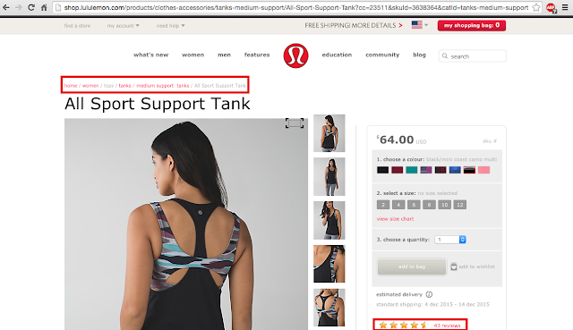
effectively using "breadcrumbs" to help navigate
Once you've found an item that catches your eye, lulu tries to make it easy to customize your order and place it into a shopping bag. With multiple colors offered in products and interactive images that change and zoom accordingly, you can create and see just what they want. At this point, we have delved pretty deep into this website, it could be easy to get lost! However, lulu utilizes the function of "breadcrumbs", a navigational aid at the top of pages that allow us to easily get back to 'home', 'women' items, 'tanks', 'medium support tanks' (Roberts & Zahay). Breadcrumbs allow for us to keep track of where are are on the site at all times. This adds to customer experience and usability in the forms of navigation, presentation and trust. 

lululemon's app

Mobile apps have become an increasingly popular way of shopping. lululemon's app is available to iPhones and Androids and is easily found. When first setting up the app, lululemon asks three questions: Where are you?, Male or Female?, and Favorite Ways to Sweat. With these questions alone, lululemon is already working to personalize the app for you right from the start.
main page in the lululemon app
The main page on the app shows us the first ad banner at the bottom of the screen. It's an ad reminding us that they do free shipping. In the upper left hand corner, boxed in blue, is the navigation tool that is easily accessed from whatever screen in the app. 
home page in the lululemon app
The home page shows us again that lulu enjoys using CSS organization. Here you can find you account information and browse product categories quickly. Categories are clearly labeled on the parent page, with the child and grand child pages following suit. Again, by tapping anywhere in the blue box, you are redirected back to the main page.

Overall, I would give lululemon's website and app usability a high rating. Their navigation is superb along with their presentation. Their graphics, language, and over "feel" of the site is welcoming and trustworthy. Both are easy to use and can help add value to customer experience. The app is especially beneficial because the entire shopping experience can fit in the palm of your hand. 

Blog Update

Since the start of my blog, I have created 6 posts. All of these posts have gotten traffic from only the United States. I have gotten 232 page views, which is relatively low to me. My posts were not spaced as well as they could have been due to extenuating travel, so quite a few of my blogs were recently added which could affect the page view metrics. My most popular blog was my first one, "Reasons Why Nike Marketing Has Been Killing the Game"  with 68 visits. This makes sense since it is the post that has been up longest, giving it more time for exposure. Traffic sources are from fellow classmates. 


Work Cited:
Roberts, Mary Lou., and Debra L. Zahay. Internet Marketing: Integrating Online and Offline Strategies. Mason, OH: South-Western Cengage Learning, 2013. Print.


Importance of IAB Display Ads and Other Ad Formats


Ad formats across the Marketing Spectrum

This week's post will focus on the different forms of online advertising and these ads' compliance with IAB Guidelines. When I looked at my three companies, I noticed that Nike and lululemon did not have advertisements on their webpages. My thinking is that since they are well established retail stores with large market shares, they do not want to promote other products and do not feel the need to use acquisition strategies. Under Armour does have a pop-up that will be discussed later. To make this post a bit more informative, I decided to also look at Reebok's online advertising efforts. In addition to analyzing online advertisements, I will be looking at how these companies' mobile sites differ from their online advertising on computer screens. At the end, I will make a suggestion for one company regarding an online advertising strategy that reinforces their brand.

IAB Guidelines and Importance 

http://blog.mgid.com/wp-content/uploads/2014/02/IAB-Logo.jpg
When online advertising first began, many consumers found them bothersome and distracting. Not much has changed regarding their annoyance, but ads have improved. To help curb the annoyance of pop-ups and ads on websites, the IAB was formed in 1996. IAB stands for the Interactive Advertising Bureau, and they are responsible for 86% of online advertising in the United States. They promote the value of the interactive advertising industry while also setting the standards and guidelines others can strive to follow. 

As the Internet matures, so must the strategies and advertisements that marketers use. We are seeing a switch from Flash advertisements due to the dwindling Flash audience and fewer mobile devices playing Flash content. An important medium to look at is the emergence of HTML5. This is the new platform for creative advertising that marketers need to take advantage of.  HTLM5 can do everything that you would want to do for an online ad without needing plugins or additional software. It's "actually three kinds of code: HTML to provide structure, Cascading Style Sheets (CSS) to take care of presentation, and JavaScript to make things happen (Marshall)! The latest IAB Guidelines promote the use of HTML5 ads. 

The following image shows the 5 main ad formats that IAB is pushing currently: 
http://www.iab.com/wp-content/uploads/2015/06/Mobile-Rising-Stars-Final-2-24-12IAB22512F_mobile.pdf

Ad Formats in Action

As stated before, Nike and lululemon lacked advertisements on their home pages. However, Under Armour had a pop-up ad that encouraged users to sign up for email notifications and promotions. It seems as though Under Armour is using their homepage as a quick spot to push their email promotions. A quick click of the "x" in the upper right corner closes the ad, and you can resume browsing. This type of ad falls under the "pushdown" category of the "Rising Star" ads, meaning that it is compliant with IAB guidelines that characterize this type of ad as pushing down site content so the ad remains center.

Since my other companies did not have advertisements, I decided to look at Reebok. They are in the same industry as Nike and Under Armour, so I thought it would be a reasonable company to use in this post. Similar to Under Armour, Reebok also promotes signing up to receive email notifications when visiting their home page. Again this form of advertising is compliant with IAB guidelines. 

I thought it was interesting that both of these companies utilized these types of ads on their homepage. I think it may have to do with the established brand awareness/recognition that Nike and lululemon have created. Two top-dog companies do not need to bother their customers with pop-ups asking to sign up to their email list. While Under Armour is a world-wide known brand, they are still working to catch up to Nike's status. Reebok is also fighting to increase their market share, so it makes sense that both of these companies are striving to acquire customers.  

Mobile vs. Computer Display

Nike's mobile display was incredibly similar to their online display. As on their landing page on computer display, Nike emphasizes their customizing option and gives quick access to NikeID.

lululemon had an for their mobile app at the top of their mobile website, boxed in blue. This form of advertising follows IAB Guidelines for Mobile Rising Stars and is classified as the adhesion banner, with a simple "x" closing the banner and allowing the consumer to continue browsing. lululemon also makes it easy to start shopping by highlighting their free shipping option, highlighted by the red box.

Under Armour, like Nike did not have any advertisements. However, they do have a quick link to their shopping cart and search bar tool to increase easy browsing and purchasing.

Reebok had an interesting notification flashed across the bottom of the screen. It was a scrolling message informing me that by clicking on this site, I would automatically be allowing cookies to start tracking my browsing. It was very quick, and at the end said I would only see this notice once. When I refreshed to try and get a screenshot of the banner, it did not come up again, but the blue box at the bottom is where the notification ran. I've never seen this happen, at least never noticed, on another site. The fact that Reebok is using cookies shows that they are working to expand their knowledge of their target audience. 


Online Advertising Strategy for lululemon

lululemon is an incredibly well established brand considering it was founded in 1998. In just under 20 years they have become a world-wide, highly desirable brand. I think that an online advertising strategy could be extremely beneficial for them. By incorporating videos, rich media content, interactive/immersive ads, and social media, lululemon could create a more personable brand. 

Personally, I love it when a company's social media accounts have personality and interact with the customers. I think that could be an area where lulu could focus on improving. I also believe that creating videos that embody their brand, which focuses on healthy, happy living while wearing comfortable, practical clothing. Improving customer experience online is another important aspect of an online advertising strategy. By creating an easy to use site with features such as cascading style sheets, large fonts, and easily accessible search and home buttons, customers will enjoy shopping online more. 


Work Cited:
*Note: all images without URLs were screenshots from my computer and iPhone.

"2015 ADVERTISING CREATIVE GUIDELINES FOR DISPLAY & MOBILE – UPDATED FOR HTML5." IAB Display Advertising Guidelines. Interactive Advertising Bureau, n.d. Web.

Marshall, Gary. "HTML5: What Is It?" TechRadar. N.p., 3 Dec. 2013. Web.